Responsive Options
- Gautam Thapar
Buttons X version 1.9.0 introduced responsive options which gave control to users to change button appearance for desktop, tablet and mobile.
Prior to version 1.9.0 Buttons X used to automatically adjust button styles based on screen size. But now this has been turned OFF by default. It is better to style your buttons for tablet and mobile screens but If you don't feel like doing so then you can turn ON automatic button styles from settings page.
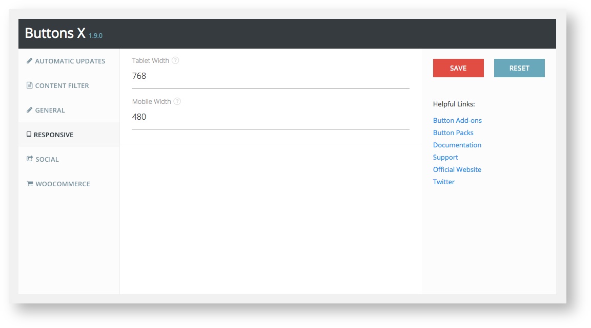
In order to set responsive styles, first you should visit the settings page and set the screen width for tablet and mobile devices. These width's trigger the respective button view.
How to set width and height:
- Visit the settings page (Buttons X > Settings).
- Then click on the "Responsive" tab.
- Enter screen width for tablet and mobile. Default screen width for tablet is 768 pixels and that for mobile is 480 pixels.
Tablet width of 768 pixels means that whenever the screen size is below 768 pixels the tablet related options you set while creating button will come into effect. Same is the case for mobile width.
Once you have set up the responsive settings, go to edit button screen. If you are new to Buttons X then make sure you first read how to create a simple button.
On edit button screen you should see "Responsive" tab under "Advanced" section. Click the "Responsive tab". Under it you should see "Tablet" and "Mobile" tabs. The options under both these tabs are exactly similar. So I will be covering only the tablet part.
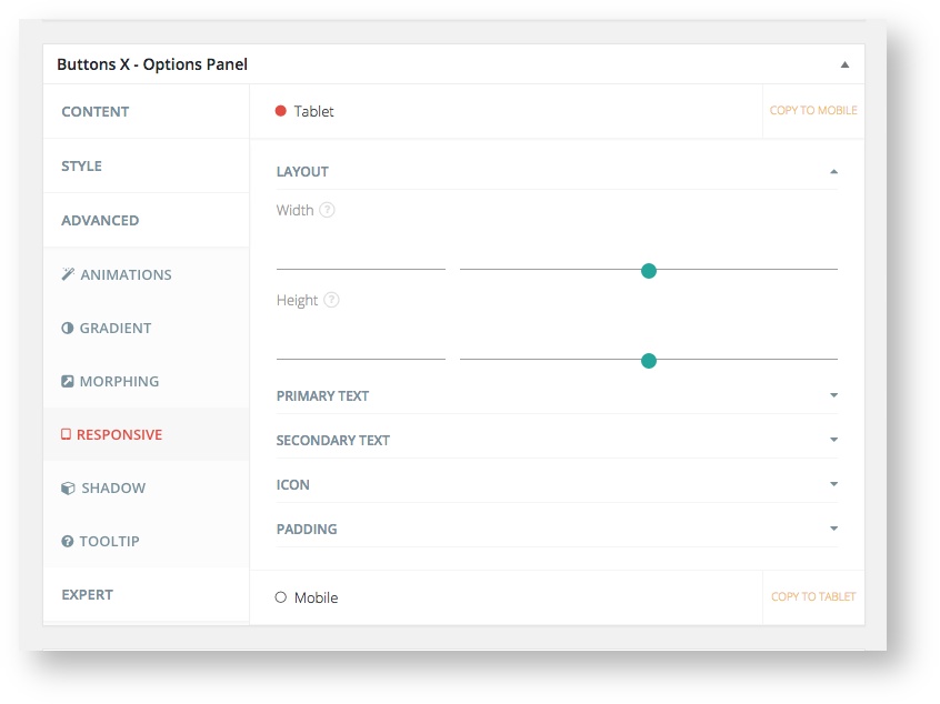
Tablet / Mobile Options
- LAYOUT - Here you can set the width and height of the button for tablets.
- PRIMARY TEXT - Under Primary Text the following options are available.
- Font Size
- Padding Top
- Padding Bottom
- Padding Left
- Padding Right
- SECONDARY TEXT - Under Primary Text the following options are available.
- Font Size
- Padding Top
- Padding Bottom
- Padding Left
- Padding Right
- ICON - Under Icon the following options are available.
- Icon Size
- Divider Size
- Divider Position
- Padding Top
- Padding Bottom
- Padding Left
- Padding Right
- PADDING - Under Padding the following options are available.
- Padding Top
- Padding Bottom
- Padding Left
- Padding Right
Only the necessary options are made available under tablet and mobile. Changing these options will change the way button appears on tablets and mobiles.
Related articles