/
Layout
Layout
- Gautam Thapar
Owned by Gautam Thapar
Last updated: Aug 13, 2015
Available Options:
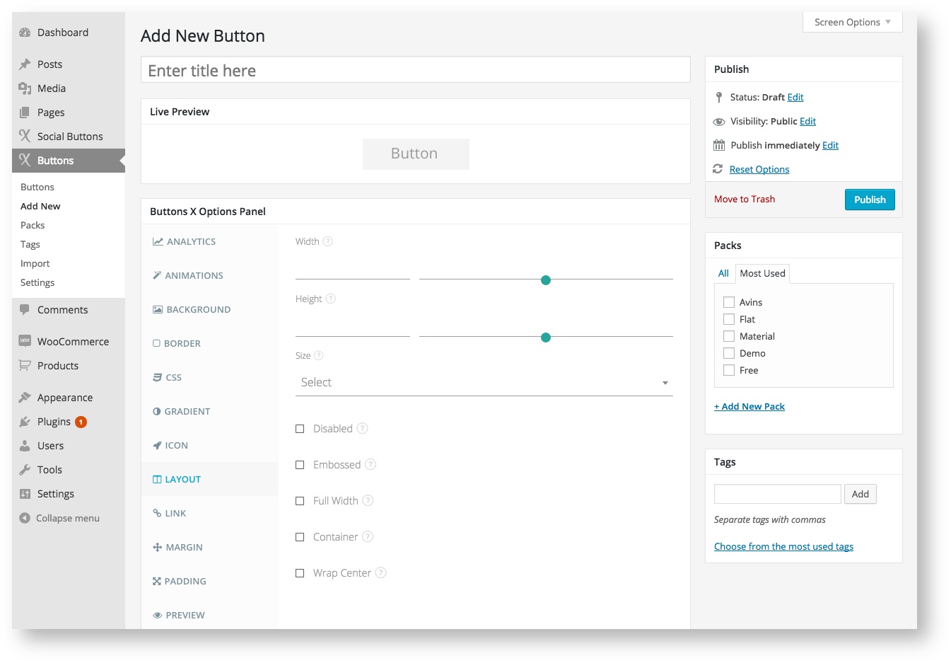
| Layout | |||||
|---|---|---|---|---|---|
| Field Label | Field Type | Short Code Attribute | Default Value | Available Values | Description |
| ID | hidden | id | (Auto generated) | - | The button ID. |
| Width | range | width | - | - | Add button width in pixels. This gives the button a fixed width. Clearing the field removes fixed width. |
| Height | range | height | - | - | Add button height in pixels. This gives the button a fixed height. Clearing the field removes fixed height. |
| Size | select | size | - | huge, large, wide, small, mini | These are some preset button sizes. Changing the size value automatically adjusts the font size and padding values of primary text. |
| Disabled | checkbox | disabled | 0 | 0, 1 | Make the button disabled by checking this field. Clicking the button won\'t be possible once disabled. |
| Embossed | checkbox | embossed | 0 | 0, 1 | Checking this field gives an embossed effect to button. |
| Full Width | checkbox | full_width | 0 | 0, 1 | Make the button cover the entire width of the container. |
| Container | checkbox | container | 0 | 0, 1 | Add a container div to button. |
| Wrap Center | checkbox | wrap_center | 0 | 0, 1 | Makes the button centered. Very helpful when you want the button to be centered inside a big container. |
, multiple selections available,
Related content
Responsive Options
Responsive Options
More like this
Buttons Tab
Buttons Tab
More like this
Secondary Text
Secondary Text
More like this
Primary Text
Primary Text
More like this
Plugin Settings
Plugin Settings
More like this
Creating a Simple Button
Creating a Simple Button
More like this