/
Morphing Buttons Extension
Morphing Buttons Extension
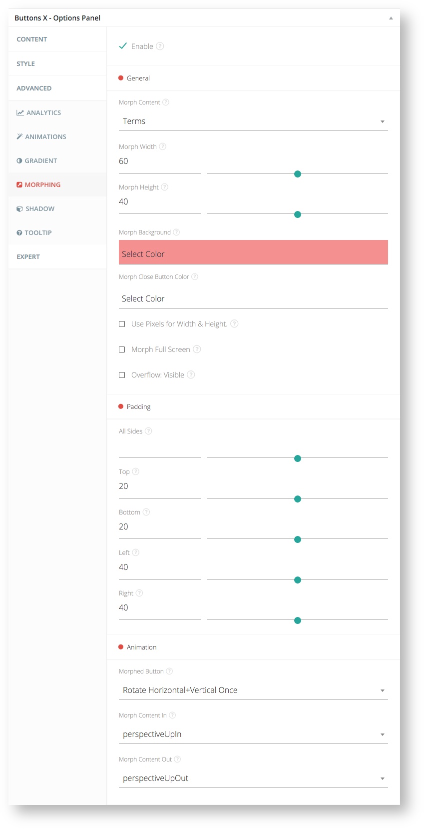
This is a premium extension for Buttons X. Detail information about morphing buttons options can be found below.
Available Options:
| Field Label | Field Type | Short Code Attribute | Default Value | Available Values | Description |
|---|---|---|---|---|---|
| Enable | checkbox | morphing_enable | 0 | 0,1 | 0=disabled,1=enabled. |
| General | |||||
| Morph Content | select | morphing_content | - | Morphing content post type posts | Select the post / page or custom post type to pull content from. |
| Morph Width | range | morphing_width | 40 | - | The width of the morphed button (modal). These are percentage values in respect to browser window size. |
| Morph Height | range | morphing_height | 40 | - | The height of the morphed button (modal). These are percentage values in respect to browser window size. |
| Morph Background | colorpicker | morphing_background | - | - | Select background color for morphed button. |
| Morph Close Button Color | colorpicker | morphing_close_color | - | - | Select color for close button. |
| Use Pixels for Width & Height | checkbox | morphing_pixel | 0 | 0,1 | 0=use pixel based values,1=use percentage based values. By default percentages are used to compute modal's width and height. If enabled above entered width and height values will be considered as pixel based values. |
| Morph Full Screen | checkbox | morphing_fullscreen | 0 | 0,1 | 0=disabled,1=enabled. If enabled the morphed button will cover the entire screen. |
| Overflow: Visible | checkbox | morphing_overflow | 0 | 0,1 | 0=disabled,1=enabled. If enabled the content will be rendered outside the container. |
| Padding | |||||
| All Sides | range | - | - | - | The padding for morphed button content (modal) that the button will be transformed into. Apply to all sides. |
| Top | range | morphing_padding_top | 40 | - | The top padding for morphed button content (modal). |
| Bottom | range | morphing_padding_bottom | 40 | - | The bottom padding for morphed button content (modal). |
| Left | range | morphing_padding_left | 40 | - | The left padding for morphed button content (modal). |
| Right | range | morphing_padding_right | 40 | - | The right padding for morphed button content (modal). |
| Animation | |||||
| Morphed Button | select | morphing_animation_morph | none | none, rotate-x, rotate-x-twice, rotate-y, rotate-y-twice, rotate-z, rotate-z-twice | Select animation for button when it is turning in/out of morph (modal). |
| Morph Content In | select | morphing_animation_content_in | none | none, transition.fadeIn, transition.flipXIn, transition.flipYIn, transition.flipBounceXIn, transition.flipBounceYIn, transition.swoopIn, transition.whirlIn, transition.shrinkIn, transition.expandIn, transition.bounceIn, transition.bounceUpIn, transition.bounceDownIn, transition.bounceLeftIn, transition.bounceRightIn, transition.slideUpIn, transition.slideDownIn, transition.slideLeftIn, transition.slideRightIn, transition.slideUpBigIn, transition.slideDownBigIn, transition.slideLeftBigIn, transition.slideRightBigIn, transition.perspectiveUpIn, transition.perspectiveDownIn, transition.perspectiveLeftIn, transition.perspectiveRightIn | Select animation for content when it appears. |
| Morph Content Out | select | morphing_animation_content_out | none | none, transition.fadeOut, transition.flipXOut, transition.flipYOut, transition.flipBounceXOut, transition.flipBounceYOut, transition.swoopOut, transition.whirlOut, transition.shrOutkOut, transition.expandOut, transition.bounceOut, transition.bounceUpOut, transition.bounceDownOut, transition.bounceLeftOut, transition.bounceRightOut, transition.slideUpOut, transition.slideDownOut, transition.slideLeftOut, transition.slideRightOut, transition.slideUpBigOut, transition.slideDownBigOut, transition.slideLeftBigOut, transition.slideRightBigOut, transition.perspectiveUpOut, transition.perspectiveDownOut, transition.perspectiveLeftOut, transition.perspectiveRightOut | Select animation for content when it disappears. |
