/
Primary Text
Primary Text
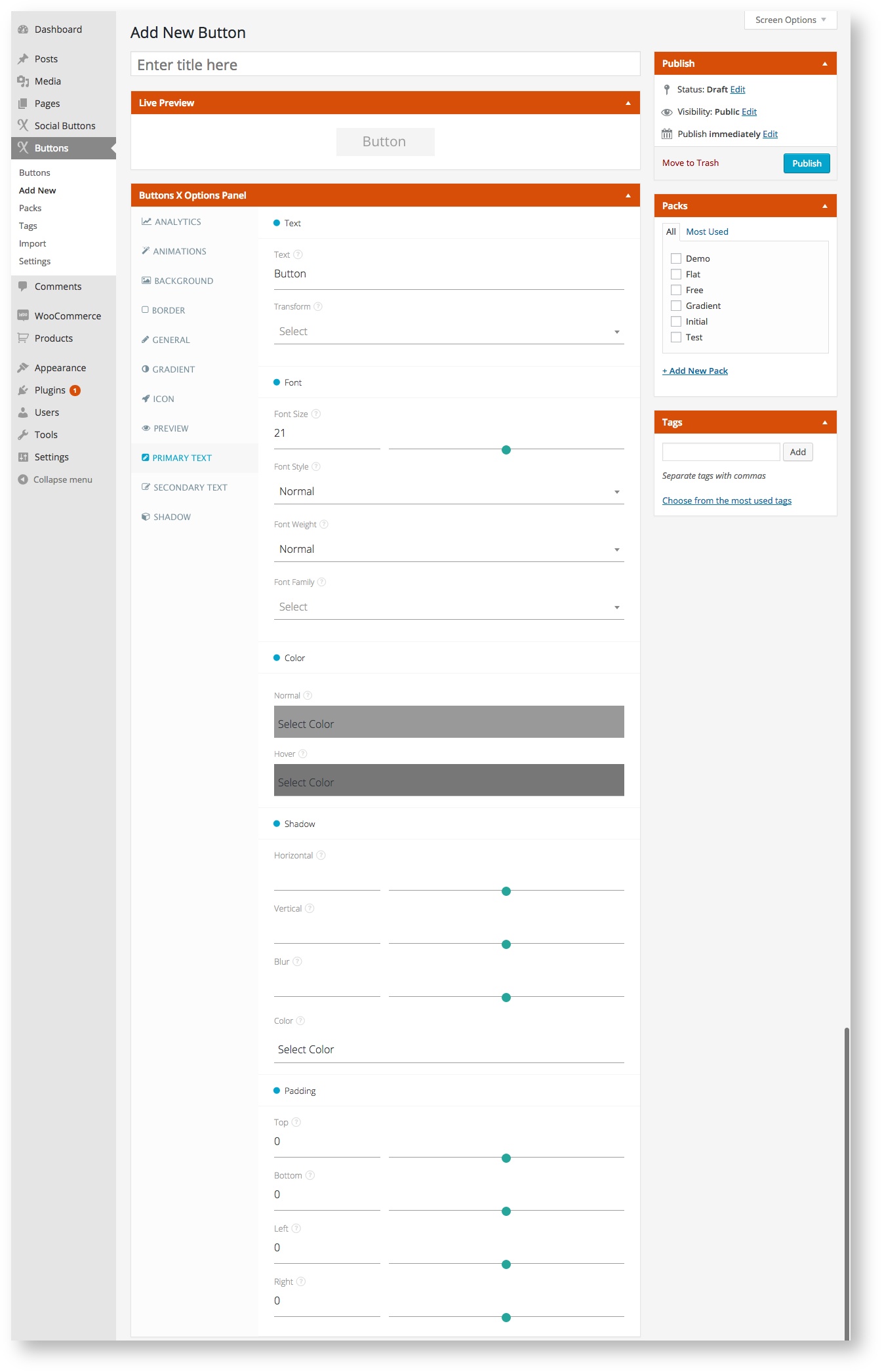
Button primary text related options comes under this tab.
Available Options:
| Field Label | Field Type | Short Code Attribute | Default Value | Available Values | Description |
|---|---|---|---|---|---|
| Text | |||||
| Text | text | text | Button | - | Add main button text. |
| Transform | select | text_transform | - | capitalize, uppercase, lowercase, inherit | This field controls the capitalization of text. |
| Font | |||||
| Font Size | range | text_font_size | 21 | - | Add font size in pixels. This will make your primary text bigger or smaller depending up on the value specified. |
| Font Style | select | text_font_style | normal | normal, italic, oblique, inherit | Select font style. This will style your primary text. Normal means as it is, italic means the text will appear slanted, oblique makes the text slanted + bold and inherit will get the style from parent element. |
| Font Weight | select | text_font_weight | normal | normal, bold, bolder, lighter, 100, 200, 300, 400, 500, 600, 700, 800, 900, inherit | Select font weight. This adds weight to text like bold makes the text stronger. 100 is lightest and 900 is boldest. |
| Font Family | select | text_font_family | - | All Google Web Fonts | Select font family. Choose from among 100's of Google Web Fonts to style primary text. |
| Color | |||||
| Normal | colorpicker | text_color_normal | #999 | - | Select text color. |
| Hover | colorpicker | text_color_hover | #777 | - | Select text color for when button is hovered. |
| Shadow | |||||
| Horizontal | range | text_shadow_horizontal | - | - | Add position of the horizontal shadow in pixels. |
| Vertical | range | text_shadow_vertical | - | - | Add position of the vertical shadow in pixels. |
| Blur | range | text_shadow_blur | - | - | Add blur radius in pixels. |
| Color | colorpicker | text_shadow_color | - | - | Pick shadow color. |
| Padding | |||||
| Top | range | text_padding_top | 0 | - | Set top padding for primary text. |
| Bottom | range | text_padding_bottom | 0 | - | Set bottom padding for primary text. |
| Left | range | text_padding_left | 0 | - | Set left padding for primary text. |
| Right | range | text_padding_right | 0 | - | Set right padding for primary text. |
