/
Gradient
Gradient
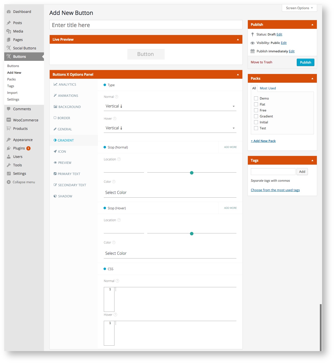
Button gradient related options comes under this tab.
Available Options:
| Field Label | Field Type | Short Code Attribute | Default Value | Available Values | Description |
|---|---|---|---|---|---|
| Type | |||||
| Normal | select | gradient_type_normal | vertical | vertical, horizontal, diagonal_top, diagonal_bottom, radial | Select gradient type. |
| Hover | select | gradient_type_hover | vertical | vertical, horizontal, diagonal_top, diagonal_bottom, radial | Select gradient type for when button will be hovered. |
| Stop (Normal) [Repeatable] | |||||
| Location | range | gradient_stop_location_normal | - | - | Set gradient stop location. Must be between 0 and 100. |
| Color | color | gradient_stop_color_normal | - | - | Set gradient stop color. |
| Stop (Hover) [Repeatable] | |||||
| Location | range | gradient_stop_location_hover | - | - | Set gradient stop location fro when button is hovered. Must be between 0 and 100. |
| Color | color | gradient_stop_color_hover | - | - | Set gradient stop color for when button is hovered. |
| CSS | |||||
| Normal | css editor | gradient_css_normal | - | - | Add custom gradient CSS. |
| Hover | css editor | gradient_css_hover | - | - | Add custom gradient CSS for when button will be hovered. |
, multiple selections available,
