Icon
- Gautam Thapar
Owned by Gautam Thapar
Last updated: Aug 03, 2015
Button icon related options comes under this tab.
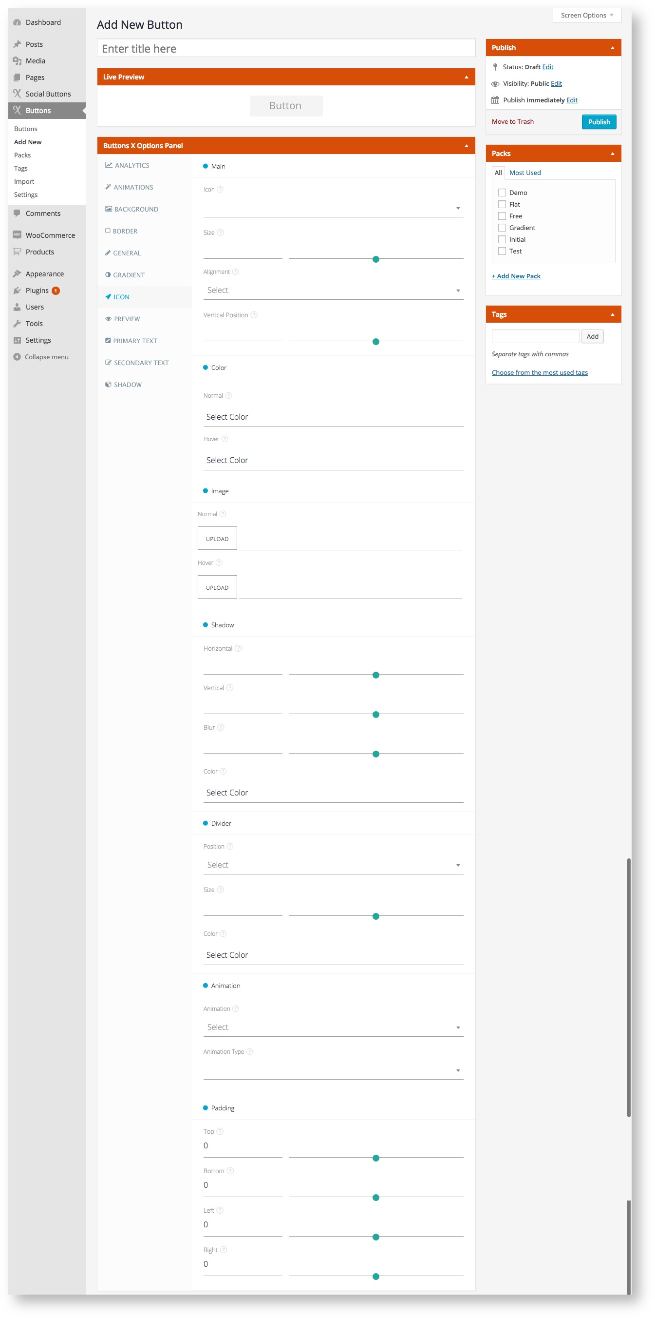
Available Options:
| Field Label | Field Type | Short Code Attribute | Default Value | Available Values | Description |
|---|---|---|---|---|---|
| Main | |||||
| Icon | select | icon | - | All Font Awesome Icons | Select the desired icon. Icon will be placed to the left of primary text if it is not already aligned. |
| Size | range | Icon_size | - | - | Add font size in pixels. This will make the icon bigger or smaller depending up on the value. Best is to keep the icon size similar to primary text size. |
| Alignment | select | icon_alignment | - | none, left, right | Align the icon as required. Left moves the icon to the left of button and right moves the icon right of the button. |
| Position | range | icon_position | - | - | Position the icon vertically. More the value more the icon will move vertically downwards. You can also specify negative values to move icon upwards. |
| Color | |||||
| Normal | colorpicker | icon_color_normal | - | - | Select icon color. |
| Hover | colorpicker | icon_color_hover | - | - | Select icon color for when button is hovered. |
| Image | |||||
| Icon Image | file | icon_image_normal | - | - | Select or upload icon image. |
| Shadow | |||||
| Horizontal | range | icon_shadow_horizontal | - | - | Add position of the horizontal shadow in pixels. Adds horizontal shadow to icon. |
| Vertical | range | icon_shadow_vertical | - | - | Add position of the vertical shadow in pixels. Adds vertical shadow to icon. |
| Blur | range | icon_shadow_blur | - | - | Add blur radius in pixels. Makes icon shadow blurry. |
| Color | colorpicker | icon_shadow_color | - | - | Pick icon shadow color. |
| Divider | |||||
| Position | select | icon_divider_position | - | none, left, right | Select divider position. Position the divider to left or right of icon. |
| Size | range | icon_divider_size | - | - | Add divider size in pixels. This will make the divider bigger or smaller depending up on the value. Best is to keep the divider size little smaller or equal to icon size. |
| Color | colorpicker | icon_divider_color | - | - | Select divider color. |
| Animation | |||||
| Animation | select | icon_animation | - | none, click, hover | Select when to animate the icon, on button click or when button is hovered. |
| Animation Type | select | icon_animation_type | - | all animate.css options | Select type of animation. Choose from many different types. |
| Padding | |||||
| Top | range | icon_padding_top | 0 | - | Set top padding for icon. |
| Bottom | range | icon_padding_bottom | 0 | - | Set bottom padding for icon. |
| Left | range | icon_padding_left | 0 | - | Set left padding for icon. |
| Right | range | icon_padding_right | 0 | - | Set right padding for icon. |
, multiple selections available,