/
Border
Border
- Gautam Thapar
Owned by Gautam Thapar
Button border related options comes under this tab.
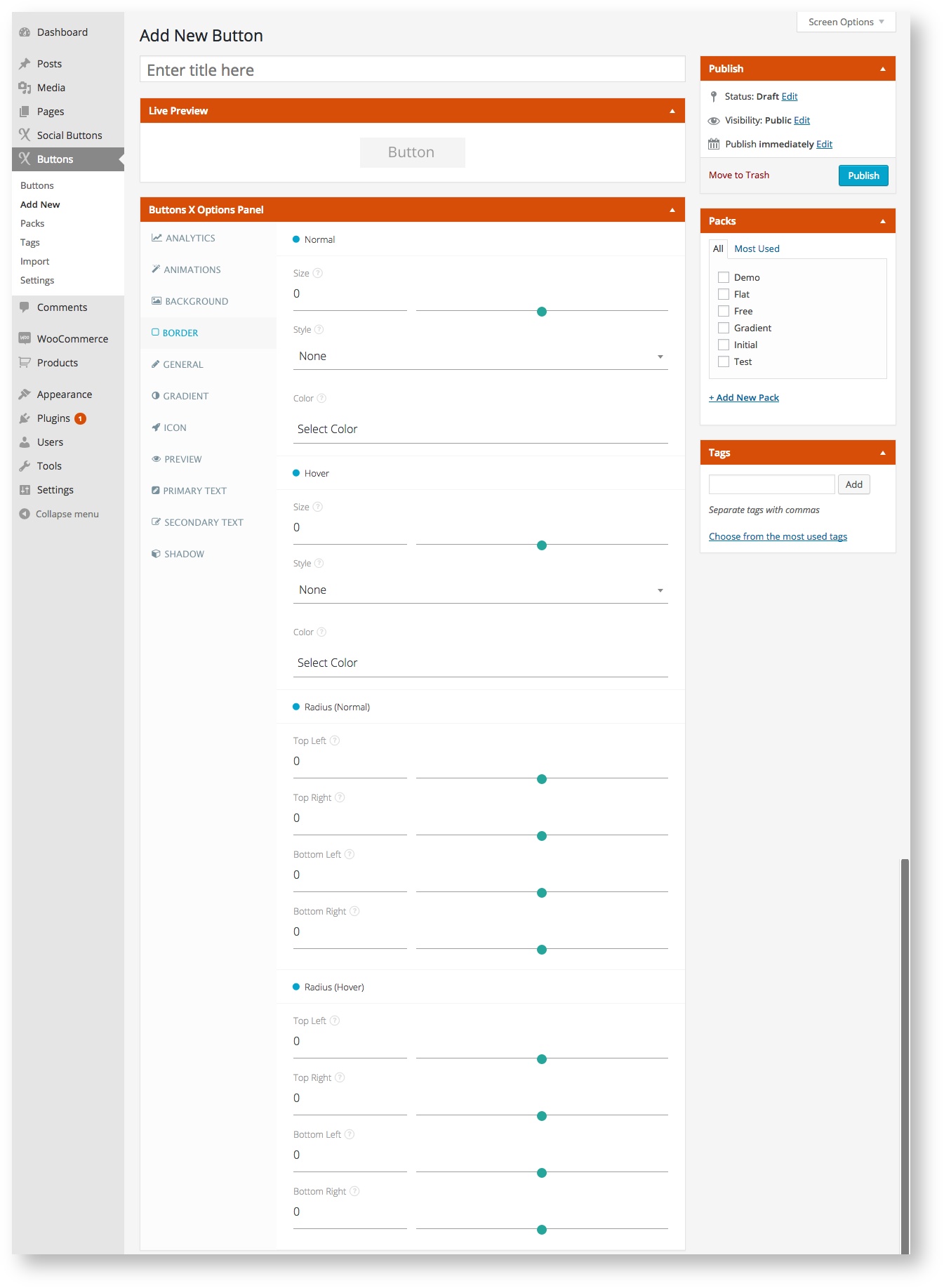
Available Options:
| Field Label | Field Type | Short Code Attribute | Default Value | Available Values | Description |
|---|---|---|---|---|---|
| Normal | |||||
| Size | range | border_size_normal | 0 | - | Set border size in pixels. |
| Style | select | border_style_normal | none | none, hidden, dotted, dashed, solid, double, groove, ridge, inset, outset, inherit | Set border style. |
| Color | colorpicker | border_color_normal | - | - | Set border color. |
| Hover | |||||
| Size | range | border_size_hover | 0 | - | Set border_size in pixels for when the button is hovered. |
| Style | select | border_style_hover | none | none, hidden, dotted, dashed, solid, double, groove, ridge, inset, outset, inherit | Set border style for when the button is hovered. |
| Radius (Normal) | |||||
| Top Left | range | border_radius_top_left_normal | 0 | - | Set top left border radius in pixels. |
| Top Right | range | border_radius_top_right_normal | 0 | - | Set top right border radius in pixels. |
| Bottom Left | range | border_radius_bottom_left_normal | 0 | - | Set bottom left border radius in pixels. |
| Bottom Right | range | border_radius_bottom_right_normal | 0 | - | Set bottom right border radius in pixels. |
| Radius (Hover) | |||||
| Top Left | range | border_radius_top_left_hover | 0 | - | Set top left border radius in pixels for when button is hovered. |
| Top Right | range | border_radius_top_right_hover | 0 | - | Set top right border radius in pixels for when button is hovered. |
| Bottom Left | range | border_radius_bottom_left_hover | 0 | - | Set bottom left border radius in pixels for when button is hovered. |
| Bottom Right | range | border_radius_bottom_right_hover | 0 | - | Set bottom right border radius in pixels for when button is hovered. |
, multiple selections available,